由于 Material Style
这样富含动画效果的用户界面风格,并不能简单的加入到以静态图形作为主要显示单元的QWidget当中。所以
Qt 官方推出了一种声明式编程语言 QML Qt QML 模块提供,该模块同时提供了 QML 和
C++ 两套接口。
Qt
Quick Qt Quick模块提供,通过import语句即可方便的进行导入。Qt
Quick 同样提供了 QML 和 C++
两套接口,可以轻松构建具有流畅动画效果的动态 QML 用户界面。而 Qt 5.7
版本以后推出的 Qt
Quick Controls
遇见 Qt 5
Qt 5 当中,QML 和 JavaScript
是创建前端 UI 界面的推荐途径,而后端则由 C++
代码进行驱动,实现类似于 Web 开发当中的前后端分离模式。
Qt Quick 是 Qt
5.14.2
QML - 用于用户界面的标记语言;JavaScript - 动态脚本语言;Qt C++ - 高度可移植的增强 C++ 库;
QML 与大名鼎鼎的 HTML
同样属于标记语言,这些标记被放置在一对花括号当中Item{},为开发人员创建
UI 界面提供了更加便捷和易与维护的方式;同时还可以加入
JavaScript 代码进一步增强 UI
的交互体验;此外,Qt Quick 很容易通过 Qt C++
扩展原生功能。
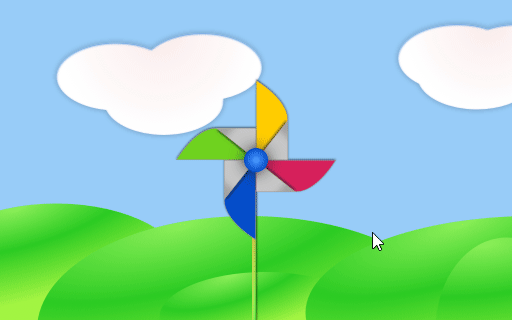
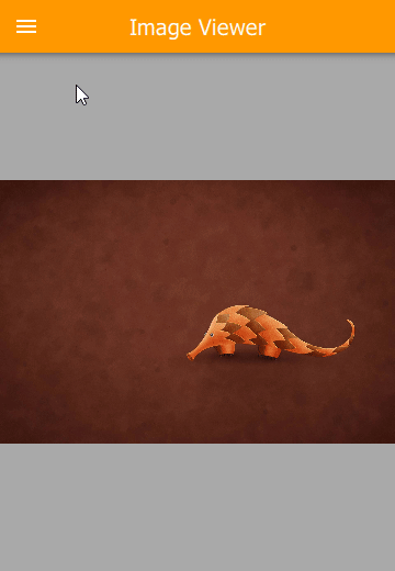
接下来,采用 Qt Quick 完成一个简单的 UI
界面,并且最终完成一个带有旋转叶片的风车动画,用鼠标点击界面任意位置即可以让风车旋转。这里从一个名称为main.qml的源代码文件开始入手(所有
QML 源代码都将会采用.qml作为后缀),作为一种与 HTML
类似的标记语言,QML 同样需要一个唯一的根类型(与 HTML 所不同的是,QML
并不限制根的类型),在当前例子中,采用可设定背景图像并具有宽高度属性的Image类型:
1
2
3
4
5
6
import QtQuick 2.12 Image { id: root source : "images/background.png" }
大多数标准类型都位于QtQuick模块当中,该模块由.qml文件开头的import语句进行导入。下面代码中的id是一个特殊的可选属性,用于在源文档的其它位置引用其所关联的类型。id属性一旦设置便不能更改,更不能在运行时进行设置。本文约定使用root关键字作为根类型的id。
1
2
3
4
5
6
7
8
9
10
11
12
13
14
15
16
17
18
19
20
21
22
23
24
25
26
27
28
29
30
31
32
33
34
35
36
37
38
39
40
41
42
43
44
45
46
47
import QtQuick 2.5 import QtGraphicalEffects 1.0 Image { id: root source : "images/background.png" property int blurRadius : 0 Image { id: pole anchors.horizontalCenter : parent .horizontalCenter anchors.bottom : parent .bottom source : "images/pole.png" } Image { id: wheel anchors.centerIn : parent source : "images/pinwheel.png" Behavior on rotation { NumberAnimation { duration : 250 } } layer.effect : FastBlur { id: blur radius : root.blurRadius Behavior on radius { NumberAnimation { duration : 250 } } } layer.enabled : true } MouseArea { anchors.fill : parent onPressed : { wheel.rotation += 90 root.blurRadius = 16 } onReleased : { root.blurRadius = 0 } } }
上面代码中的anchor属性用于指定父对象、兄弟对象之间的几何图形关系。此外,为了创造点击鼠标让风车旋转的效果,代码里还增加了一个MouseArea类型,并用其覆盖根类型root的整个区域。用户在该覆盖区域内单击鼠标就会发出信号,此时连接到该信号的onPressed事件函数将被触发,然后将id为wheel的风车图像旋转90度。
这样,每当用户单击鼠标,风车轮子都会旋转,但是这种旋转效果并非连续的,因此需要添加动画效果以实现平滑移动,这里我们采用Behavior为指定类型属性增加动画效果,只要属性发生变化,动画效果就会得到渲染。这样,当轮子的旋转属性发生变化时,就会呈现一段长度为250毫秒的NumberAnimation动画。概而言之,每一个90度的变化都会花费掉250毫秒的时间,从而呈现出平滑的动画效果。
Qt 模块库
Qt 5 包含有大量供开发人员使用的模块库(参见官方文档中的《All
Modules》 部份内容),并分为核心基础模块 (Core-Essential
Modules)与附加模块 (Add-On Modules)。
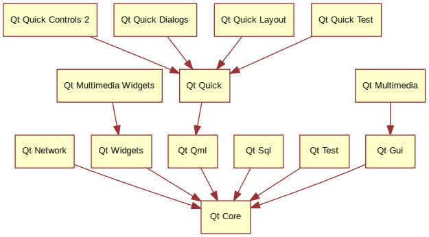
核心基础模块
核心基础模块 对于任何支持 Qt
的平台都是必需的,它们为采用 Qt Quick 2 开发应用程序提供了基础。
模块
功能描述
Qt Core 供其他模块使用的核心非图形类;
Qt GUI 图形用户界面 GUI 组件的基类;
Qt Multimedia 音频、视频、收音机、相机功能相关的类;
Qt Multimedia Widgets 基于 Widget 的用于实现多媒体功能的类;
Qt Network 让网络编程更加容易以及更加方便移植的类;
Qt QML QML 和 JavaScript 语言相关的类;
Qt Quick 一款用于构建自定义动态应用程序的声明式框架;
Qt Quick Controls 2 提供创建高性能用户界面,并采用统一样式体系的轻量级 QML 类型;
Qt Quick Dialogs 用于创建 Qt Quick 应用程序中系统对话框并与之交互的类型;
Qt Quick Layouts 用于在用户界面当中对 Qt Quick 项目进行布局;
Qt Quick Test 用于 QML 应用程序的单元测试框架,其测试用例采用 JavaScript
函数;
Qt SQL 用于集成 SQL 数据库的类;
Qt Test 单元测试 Qt 应用程序时需要采用的类库;
Qt Widgets 继承于 C++ Widgets 的 Qt GUI 类;
各种核心基础模块的具体继承关系如下图所示:
附加模块
除了核心基础模块 之外,Qt 5
还提供了针对特定目的的附加模块 ,它们要么是为了保证向后兼容性而存在,要么是只用于适配特定平台。
模块
功能描述
Qt 3D 一组让 3D 图形编程更加容易的声明式 API;
Qt Bluetooth 使用蓝牙无线技术的 C++ 与 QML API;
Qt Canvas 3D 在采用 JavaScript 的 Qt Quick 应用程序中,开启类似 OpenGL 的 3D
绘图特性;
Qt Graphical Effects 用于 Qt Quick 的图形效果;
Qt Location 在 QML 应用程序中显示地图和导航以及放置内容;
Qt Network Authorization 提供对基于 OAuth 的在线服务授权支持;
Qt Positioning 提供对位置、卫星和区域监控类的访问;
Qt Purchasing 允许在 Qt 应用程序内购买商品(仅适用于 Android、iOS、MacOS);
Qt Sensors 提供对传感器与动作手势识别的操作;
Qt Wayland Compositor 提供一个开发 Wayland 合成程序的框架(仅限于 Linux);
Qt Virtual Keyboard 实现不同输入方法和 QML
虚拟键盘的框架,支持本地化的键盘布局以及自定义视觉主题;
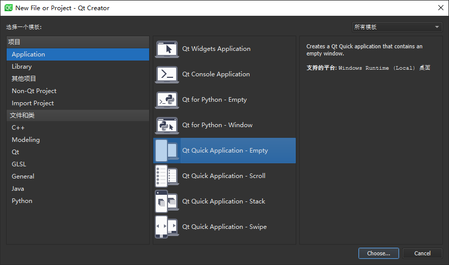
创建 Qt Creator 项目
选择顶部菜单栏上的【文件 >
新建文件或项目...】或者直接按下快捷键【Ctrl +
N】,打开新建文件或项目对话框:
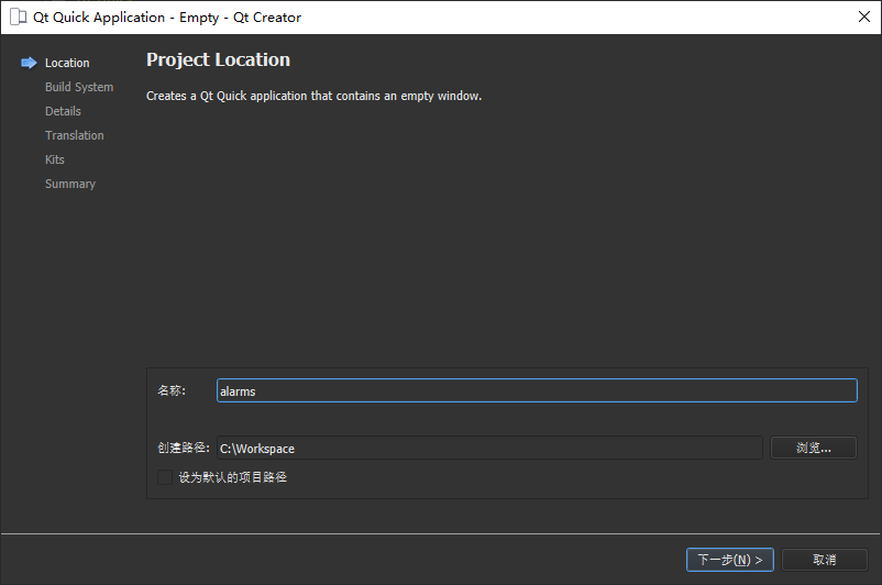
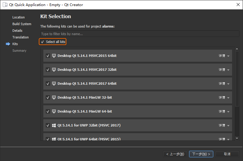
点击【Choose...】按钮,选择项目保存的位置,并且将其命名为alarms:
保持默认设置点击【下一步】,进入到如下工具箱选择界面时,注意勾选全部工具:
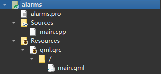
Qt Quick 应用程序向导创建的空项目里面,默认会包含如下源文件:
1 2 3 4 5 6 7 8 C:\Workspace \alarms λ tree /f alarms.pro # 项目文件 alarms.pro.user main.cpp # 应用程序的主 C ++ 代码 main.qml qml.qrc # 资源文件,包含除 main.cpp 和项目文件之外的所有资源文件名称
此时,Qt Creator 里实际呈现的项目结构如下图所示:
其中,main.cpp文件当中自动生成的代码主要用于启用 DPI
高缩放、声明app和engine。然后加载主 QML
文件main.qml。
1 2 3 4 5 6 7 8 9 10 11 12 13 14 15 16 17 18 19 20 21 #include <QGuiApplication> #include <QQmlApplicationEngine> int main (int argc, char *argv[]) QCoreApplication::setAttribute (Qt::AA_EnableHighDpiScaling); QGuiApplication app (argc, argv) ; QQmlApplicationEngine engine; const QUrl url (QStringLiteral("qrc:/main.qml" )) QObject::connect (&engine, &QQmlApplicationEngine::objectCreated, &app, [url](QObject *obj, const QUrl &objUrl) { if (!obj && url == objUrl) QCoreApplication::exit (-1 ); }, Qt::QueuedConnection); engine.load (url); return app.exec (); }
QML 语法
QML
是一种用于描述应用程序外观的声明性语言,通过条例清晰的层次结构将用户界面分解为更小粒度的元素,然后由这些元素组成各类组件。其中,子元素会从父元素继承屏幕坐标位置,一个元素的x、y坐标总是相对于父元素的坐标位置而言。此外,还可以通过
JavaScript 代码丰富界面的交互功能,类似于 Web 开发当中 HTML 和
JavaScript 的关系。下面从一个简单的 QML 文件示例着手,展现 QML
的如下语法特性。
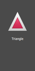
1 2 3 4 5 6 7 8 9 10 11 12 13 14 15 16 17 18 19 20 21 22 23 24 25 import QtQuick 2.5 Rectangle { id: root width : 120 ; height : 240 color : "#4A4A4A" Image { id: triangle x : (parent .width - width)/2 ; y : 40 source : 'assets/triangle_red.png' } Text { y : triangle.y + triangle.height + 20 width : root.width color : 'white' horizontalAlignment : Text.AlignHCenter text : 'Triangle' } }
import语句用于导入指定版本的模块;同 C/C++ 和 JavaScript 一样,QML
也可以采用//...和/* ... */风格的注释。
与 HTML 一样,每个 QML
文件都需要有一个根元素,通常将其命名为root;
一个 QML 元素由其类型名称后面跟{}进行声明;
元素可以拥有name: value格式的属性;
可以通过使用 QML
文档中任意元素的id属性来访问这个元素;
元素可以嵌套使用,这意味着父元素可以拥有子元素,也可以使用parent关键字访问父元素;
可以通过D:\Software\Tech\Qt\5.14.2\msvc2017\bin下的qmlscene工具,从命令行运行上述的.qml示例程序,当然也可以将其加入当前操作系统的环境变量,直接运行如下命令:
1 λ qmlscene RectangleExample.qml
当然,也可以在 Qt Creator
当中直接【运行】RectangleExample.qml:
属性
元素的属性是通过元素名称:元素值这样的键值对来进行定义的,并且可以拥有相应的初始值。
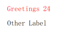
1
2
3
4
5
6
7
8
9
10
11
12
13
14
15
16
17
18
19
20
21
22
23
24
25
26
27
28
29
30
31
32
33
34
35
36
37
38
39
40
41
42
43
import QtQuick 2.5 Rectangle { width : 240 height : 120 Text { id: thisLabel x : 24 ; y : 16 height : 2 * width property int times : 24 property alias anotherTimes : thisLabel.times text : "Greetings " + times font.family : "Ubuntu" font.pixelSize : 24 KeyNavigation.tab : otherLabel onHeightChanged : console .log('height:' , height) focus : true color : focus?"red" :"black" } Text { id: otherLabel x : 24 y : 64 text : "Other Label" font.family : "Ubuntu" font.pixelSize : 24 KeyNavigation.tab : thisLabel color : focus?"red" :"black" } }
id属性主要用于引用当前 QML
文档中的元素,因此其值在当前文档中必须唯一,并且不能随意修改;因为 QML
提供了一种称为动态作用域 的机制,该机制下,后续加载文档的元素id会覆盖之前加载的文档,这极有可能造成文档覆盖过程当中引用到错误的元素id,所以使用时需要额外注意。;此外,id的属性值并非字符串类型,而是属于
QML 语法当中标识符的一部分;属性可以根据其类型设置属性值,如果没有为属性指定值,则将默认选择初始值;
属性依赖于一个或者多个其它属性被称为绑定 ,当其依赖的属性发生变化时,被绑定的属性就会得到更新,例如上面代码当中,height总是被约束为width的两倍;
添加自定义属性时,需要使用property属性限定符,后面添加属性的类型、名称、以及可选的初值:property <type> <name>:<value>;如果没有给定初值,则选择系统初始值;如果没有属性名称,则可以在属性声明前面添加default关键字,将其声明为默认的属性。例如:添加子元素时,如果它们都是可见元素,则这些子元素会被自动添加至list类型的默认属性children下面;
另一种声明属性的重要方法是采用alias关键字:property alias <name>:<reference>。alias关键字允许我们将一个对象的属性或者对象本身,从类型内部提升至外部作用域。稍后在通过定义组件将内部属性或元素id导出至root级别时,将会使用该技巧。一个属性别名不需要类型,而使用其引用的属性或者对象的类型;
text属性依赖于int类型的自定义属性times,而基于int类型的值会被自动转换为string类型。text属性的表达式部分则是绑定 的另一个例子,每次times属性发生更改时,都会导致内容被更新。分组属性(Grouped
Property)用于更加结构化的组织属性;此外,上面代码中的font属性还可以写作:font { family: "Ubuntu"; pixelSize: 24 };
对于只在应用中出现一次的全局元素(例如:键盘输入),一些属性可以被附加到元素本身,具体语法为:<Element>.<property>:<value>;
针对每个属性,可以提供一个信号处理程序,该处理程序会在属性发生变化之后进行调用,例如:在界面高度变化时打印消息到内置控制台;
脚本
QML 和 JavaScript
是非常好的搭配,本小节主要用于展现两者的关系,后续会开辟专门的小节讲解关于
JavaScript 更为详细的内容。
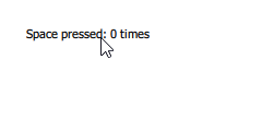
1
2
3
4
5
6
7
8
9
10
11
12
13
14
15
16
17
18
19
20
21
22
23
24
25
26
27
28
29
30
31
32
33
import QtQuick 2.5 Rectangle { width : 240 height : 120 Text { id: label x : 24 ; y : 24 property int spacePresses : 0 text : "Space pressed: " + spacePresses + " times" onTextChanged : console .log("text changed to:" , text) focus : true Keys.onSpacePressed : { increment() } Keys.onEscapePressed : { label.text = '' } function increment ( spacePresses = spacePresses + 1 } } }
文本更新处理程序onTextChanged()会在每次按下空格键的时候,打印当前更新的文本内容;
当文本元素接收到空格键时,调用 1 个 JavaScript
函数increment();
以function <name>(<parameters>) { ... }定义一个对计数器spacePressed进行递增处理的
JavaScript 函数;
QML 当中的绑定 与 JavaScript
当中赋值 的区别,在于绑定 是一个贯穿其生命周期的合约,而赋值 则是一次性的值分配。此外,绑定 的生命周期会在进行新的绑定设定时结束,甚至在
JavaScript
重新赋值该属性时也将会终结。例如上面代码中,按下【ESC】按键之后,再次按下空格键将不会再显示任何内容,因为之前的文本属性绑定text: “Space pressed: ” + spacePresses + ” times”已经被销毁。
1
2
3
Keys.onEscapePressed : { label.text = '' }
基本元素
元素可以分为视觉元素 (具有几何形状,通常显示为屏幕上的一个区域,例如矩形Rectangle)和非视觉元素 (提供一般功能,通常用于操作可视元素,例如计时器Timer)。虽然通过
Qt Quick Controls 2
模块可以创建出丰富的用户界面,但是本小节只聚焦于Item、Rectangle、Text、Image、MouseArea等基本视觉元素。
Item 元素
Item是所有视觉元素的父元素,其它所有视觉元素都继承自Item,它本身并不绘制任何内容,只是定义了所有视觉元素中一些通用的属性,这些属性在每个可视元素上都可以通用,本小节后续内容将会逐步介绍其使用。
分组
属性
几何特性 x和y定义在元素相对左上角的位置,width和height用于设定元素的宽高度,z用于控制堆叠顺序;
布局处理 锚(left、right、top、bottom、vertical
和 horizontal center)用于控制元素的相对定位;
按键处理 Key和KeyNavigation属性用于控制键的处理,并且首先需要输入focus属性使能键的处理;
过渡效果 scale和rotate过渡效果,可以针对x、y、z方向过渡的通用transform属性列表,以及它们的transformOrigin;
视觉效果 opacity属性用于控制透明度,visible用于隐藏和展示元素,clip用于约束元素绘制操作的边界,而smooth属性则用于增强渲染质量;
状态定义 支持状态列表的states列表属性,针对当前状态的state属性,以及针对动画状态改变的transitions列表属性;
注意:Item元素通常用作其它元素的容器,类似于 HTML
当中的div元素。
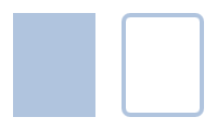
Rectangle 元素
Rectangle继承自Item并为其添加了填充颜色(可以使用
RGB
或者颜色名称),此外还支持通过border.color和border.width定义其边界,或者采用radius属性创建圆角矩形。
1
2
3
4
5
6
7
8
9
10
11
12
13
14
15
16
17
18
19
20
21
import QtQuick 2.5 Item { width : 200 height : 120 Rectangle { id: rect1 x : 12 ; y : 12 width : 76 ; height : 96 color : "lightsteelblue" } Rectangle { id: rect2 x : 112 ; y : 12 width : 76 ; height : 96 border.color : "lightsteelblue" border.width : 4 radius : 8 } }
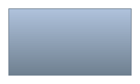
除了填充颜色和边框以外,矩形还可以支持自定义的渐变色。gradient属性由一系列梯度停止点 进行定义,每个停止点都拥有position(基于纵坐标轴标记位置,0代表顶部,1代表底部)和color(标记该停止点的颜色)属性。
1
2
3
4
5
6
7
8
9
10
11
12
13
14
15
16
17
import QtQuick 2.5 Item { width : 200 height : 120 Rectangle { id: rect1 x : 12 ; y : 12 width : 176 ; height : 96 gradient : Gradient { GradientStop { position : 0.0 ; color : "lightsteelblue" } GradientStop { position : 1.0 ; color : "slategray" } } border.color : "slategray" } }
注意 :没有设置宽高度的矩形将不可见,特别是当几个矩形的宽高度相互依赖时,就会经常发生这种情况,所以需要特别注意。另外不支持创建拥有角度的gradient,建议使用预定义的图片完成类似功能。
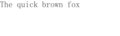
Text 元素
Text元素用于显示文本,该元素可以根据当前的文本与字体计算其初始宽高度。我们可以通过字体分组属性font.family、font.pixelSize等来设置字体,或者使用color属性改变文本的颜色。
1
2
3
4
5
6
7
8
9
10
11
12
13
import QtQuick 2.5 Rectangle { width : 400 height : 120 Text { text : "The quick brown fox" color : "#303030" font.family : "Ubuntu" font.pixelSize : 28 } }
可以使用horizontalAlignment和verticalAlignment属性对文本进行水平或者垂直对齐,或者使用style和styleColor属性进一步增强文本呈现,实现轮廓、凸起、凹陷的文字效果。此外,还可以采用elide属性对长文本内容进行省略(左、中、右)处理。如果不希望出现省略号...,那么可以使用明确设置了宽度的wrapMode属性包装文本。
1
2
3
4
5
6
7
8
9
10
11
12
13
14
15
import QtQuick 2.5 Rectangle { width : 400 height : 120 Text { width : 40 ; height : 120 text : 'A very long text' elide : Text.ElideMiddle style : Text.Sunken styleColor : '#FF4444' verticalAlignment : Text.AlignTop } }
Text元素只用于显示文本,并不渲染任何背景,所以文本元素是透明 的。其初始宽高度取决于字符串本身以及字体,没有宽度(初始宽度为0)和内容时文本元素将不会可见。此外,在对
Text
元素进行布局时,需要注意区分当前调整的是Text元素当中文本的布局(采用horizontalAlignment和verticalAlignment属性),还是只调整Text元素在父元素当中的位置(采用anchors属性)。
Image 元素
Image元素能够显示各种格式的图像,除了用于提供图片地址的source属性之外,还包含一个用于改变大小的fillMode属性。
1
2
3
4
5
6
7
8
9
10
11
12
13
14
15
16
17
18
19
20
21
import QtQuick 2.5 Rectangle { width : 400 ; height : 100 color : '#333333' Image { x : 12 ; y : 12 source : "assets/triangle_red.png" } Image { x : 12 +64 +12 ; y : 12 height : 72 /2 source : "assets/triangle_red.png" fillMode : Image.PreserveAspectCrop clip : true } }
Image元素的clip属性用于开启图片自动剪裁功能,从而避免将图片渲染至Image元素范围之外。默认情况下,剪裁功能是关闭的clip: false,此时可以通过clip: true进行开启。
MouseArea 元素
MouseArea元素通常用于与其它可视元素进行交互,它是一个可以捕获到鼠标事件 的矩形不可见项目。
1
2
3
4
5
6
7
8
9
10
11
12
13
14
15
16
17
18
19
20
21
22
23
24
25
26
27
28
import QtQuick 2.5 Rectangle { width : 200 height : 120 Rectangle { id: rect1 x : 12 ; y : 12 width : 76 ; height : 96 color : "lightsteelblue" MouseArea { id: area width : parent .width height : parent .height onClicked : rect2.visible = !rect2.visible } } Rectangle { id: rect2 x : 112 ; y : 12 width : 76 ; height : 96 border.color : "lightsteelblue" border.width : 4 radius : 8 } }
Qt Quick 提倡将交互部分与可视化部分相分离,对于更加复杂的交互,Qt
5.12 引入了 Qt
Quick Input Handlers
代替诸如MouseArea、Flickable这样的元素,其思想是在每个处理程序实例中处理一个交互方面,而不是像以前那样将来自给定源的所有事件集中在单个元素中处理。
组件
组件(Components)是一种可供重用的元素,QML
提供了多种创建组件的方法。本小节只讲解最为简单的基于文件的组件,即一个放置了
QML 元素的.qml文件。
1
2
3
4
5
6
7
8
9
10
11
12
13
14
15
16
17
18
19
20
21
22
23
import QtQuick 2.5 Rectangle { id: root property alias text : label.text signal clicked width : 116 ; height : 26 color : "lightsteelblue" border.color : "slategrey" Text { id: label anchors.centerIn : parent text : "Start" } MouseArea { anchors.fill : parent onClicked : { root.clicked() } } }
上面定义的Button组件在根级别上暴露了text和clicked信号,并将根元素命名为root以简化引用,同时采用了
QML 的别名 特性,将嵌套 QML
元素中的text属性导出至root级别,因为只有根级别的属性可以被其它组件从该源文件的外部访问 。如果要使用这个组件,则只需要在源文件对其进行声明即可:
1
2
3
4
5
6
7
8
9
10
11
12
13
14
15
16
17
18
19
20
21
22
23
24
25
import QtQuick 2.5 Rectangle { width : 140 height : 120 Button { id: button x : 12 ; y : 12 text : "Start" onClicked : { status.text = "Button clicked!" } } Text { id: status x : 12 ; y : 76 width : 116 ; height : 26 text : "waiting ..." horizontalAlignment : Text.AlignHCenter } }
点击【Start】按钮之后,文本内容将会从waiting...变为Button clicked!。
过渡效果
QML
的Item元素可以呈现平移、旋转、缩放等过渡动画,简单的移动效果可以通过改变元素的x,y坐标位置来实现,而旋转效果可以使用rotation属性(0°
~
360°),缩放效果则可以借助scale属性(<1意味元素缩小,>1意味元素放大)。对元素进行旋转和缩放操作并不会改变其几何形状,元素本身的x、y、width、height并不会因此发生变化,仅仅是进行了过渡动画的绘制而已。
1
2
3
4
5
6
7
8
9
10
11
12
13
14
15
16
17
18
19
20
21
22
23
24
25
26
27
28
29
30
31
32
33
34
35
36
37
38
39
40
41
42
43
44
45
46
47
48
49
50
51
52
53
54
55
56
57
58
59
60
61
62
63
64
65
66
67
68
69
import QtQuick 2.5 Item { width : bg.width height : bg.height Image { id: bg source : "assets/background.png" } MouseArea { id: backgroundClicker anchors.fill : parent onClicked : { circle.x = 84 box.rotation = 0 triangle.rotation = 0 triangle.scale = 1.0 } } ClickableImage { id: circle x : 84 ; y : 68 source : "assets/circle_blue.png" antialiasing : true onClicked : { x += 20 } } ClickableImage { id: box x : 164 ; y : 68 source : "assets/box_green.png" antialiasing : true onClicked : { rotation += 15 } } ClickableImage { id: triangle x : 248 ; y : 68 source : "assets/triangle_red.png" antialiasing : true onClicked : { rotation += 15 scale += 0.05 } } function _test_transformed ( circle.x += 20 box.rotation = 15 triangle.scale = 1.2 triangle.rotation = -15 } function _test_overlap ( circle.x += 40 box.rotation = 15 triangle.scale = 2.0 triangle.rotation = 45 } }
上面代码中,作为背景图片的MouseArea覆盖了整个背景区域,点击后可以重置所有ClickableImage元素的位置。而圆形circle_blue.png会在每次鼠标点击的时候增加x轴位置,方框box_green.png会在每次鼠标点击时进行旋转,三角形triangle_red.png则会在旋转的同时进行缩放。三个元素都设置了antialiasing : true以启动反锯齿效果,该属性出于性能原因被默认为false。
注意 :QML
文档中元素出现的先后顺序非常重要,最先 出现的元素具有更低 的堆叠顺序,所以会发现圆形circle_blue.png会移动到方框box_green.png下方,这个堆叠顺序也可以通过元素的z属性来设置。
有许多 QML
元素用于定位项。这些被称为定位器,模块的行、列、网格和流中提供了以下内容。它们可以在下图中看到相同的内容。
定位元素
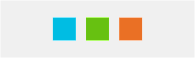
QtQuick模块提供了Row、Column、Grid、Flow四种定位器元素,在进入详细的讨论之前,先介绍如下分别用于展示48x48像素的红色RedSquare.qml、蓝色BlueSquare.qml、绿色GreenSquare.qml、浅色BrightSquare.qml、深色DarkSquare.qml的自定义矩形组件,它们都使用了Qt.lighter(color)在填充颜色的基础上生成浅色的边框。
1 2 3 4 5 6 7 8 9 import QtQuick 2.5 Rectangle { width : 48 height : 48 color : "#00bde3" border.color : Qt.lighter(color ) }
1 2 3 4 5 6 7 8 9 import QtQuick 2.5 Rectangle { width : 48 height : 48 color : "#f0f0f0" border.color : Qt.lighter(color ) }
1 2 3 4 5 6 7 8 9 import QtQuick 2.5 Rectangle { width : 48 height : 48 color : "#3c3c3c" border.color : Qt.darker(color ) }
1 2 3 4 5 6 7 8 9 import QtQuick 2.5 Rectangle { width : 48 height : 48 color : "#67c111" border.color : Qt.lighter(color ) }
1 2 3 4 5 6 7 8 9 import QtQuick 2.5 Rectangle { width : 48 height : 48 color : "#ea7025" border.color : Qt.lighter(color ) }
Column 元素
Column元素可以将子元素布局为一个列 ,并且通过spacing属性可以将每个子元素间隔指定的宽度。
1
2
3
4
5
6
7
8
9
10
11
12
13
14
15
16
import QtQuick 2.5 DarkSquare { id: root width : 120 height : 240 Column { id: row anchors.centerIn : parent spacing : 8 RedSquare { } GreenSquare { width : 96 } BlueSquare { } } }
Row 元素
Row元素将子元素放置在一个行 上面,并根据layoutDirection属性决定从左至右 还是从右至左 ,在这里spacing属性依然可以设置每个子元素的间隔宽度。
1
2
3
4
5
6
7
8
9
10
11
12
13
14
15
import QtQuick 2.5 BrightSquare { id: root width : 400 ; height : 120 Row { id: row anchors.centerIn : parent spacing : 20 BlueSquare {} GreenSquare {} RedSquare {} } }
Grid 元素
Grid元素用于将子元素排列在一个网格 当中,通过设置rows和columns属性可以限制行或者列的数量,如果缺省设置其中一个,那么另一个将会根据当前子元素数量自动计算获得。例如在rows = 3的同时添加6个子元素,则可以自动计算出columns = 2列。Grid元素的flow和layoutDirection属性用于控制元素在网格中的排列顺序,而spacing属性同样用于控制子元素的间隔距离。
1
2
3
4
5
6
7
8
9
10
11
12
13
14
15
16
17
18
19
import QtQuick 2.5 BrightSquare { id: root width : 160 height : 160 Grid { id: grid rows : 2 columns : 2 anchors.centerIn : parent spacing : 8 RedSquare { } RedSquare { } RedSquare { } RedSquare { } } }
Flow 元素
Flow元素能够对子元素进行流 式布局,属性flow和layoutDirection用于控制流的方向(从上至下或者从左至右)。为了流式布局能够正常工作,元素必须拥有一个高度和宽度。
1
2
3
4
5
6
7
8
9
10
11
12
13
14
15
16
import QtQuick 2.5 BrightSquare { id: root width : 160 height : 160 Flow { anchors.fill : parent anchors.margins : 20 spacing : 20 RedSquare { } BlueSquare { } GreenSquare { } } }
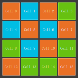
Repeater 元素
Repeater元素的作用类似于for循环,在最简单的情况下,可以采用其生成一个循环的数值。
1
2
3
4
5
6
7
8
9
10
11
12
13
14
15
16
17
18
19
20
21
22
23
24
25
26
27
28
import QtQuick 2.5 DarkSquare { id: root width : 252 height : 252 property variant colorArray : ["#00bde3" , "#67c111" , "#ea7025" ] Grid { anchors.fill : parent anchors.margins : 8 spacing : 4 Repeater { model : 16 Rectangle { width : 56 ; height : 56 property int colorIndex : Math .floor(Math .random()*3 ) color : root.colorArray[colorIndex] border.color : Qt.lighter(color ) Text { anchors.centerIn : parent color : "#f0f0f0" text : "Cell " + index } } } } }
在上面的例子当中,Repeater元素根据其model属性的值生成了16个矩形。而在内嵌的Rectangle元素里,则采用了
JavaScript
数学函数Math.floor(Math.random()*3)生成0 ~ 2范围数值,从colorArray数组里随机选择矩形的背景颜色。Repeater元素会自动向Rectangle注入一个index属性(0 ~ 15),上面代码就采用了该属性在Text元素上生成网格内的矩形编号。
布局元素
QML
提供了anchors属性来更加灵活的布局元素,anchors是Item元素的基本属性之一,表达元素之间的相对关系 ,能够用于所有可见的
QML 元素。
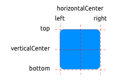
每个 QML
元素拥有top、bottom、left、right、horizontalCenter、verticalCenter六条主要锚线,除此之外,Text元素还拥有一条baseline锚线。每条锚线都拥有相应的偏移量,在top、bottom、left、right当中这个偏移量被称为margins,而对于horizontalCenter、verticalCenter、baseline则被称为offsets。
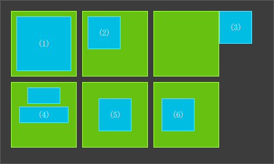
1
2
3
4
5
6
7
8
9
10
11
12
13
14
15
16
17
18
19
20
21
22
23
24
25
26
27
28
29
30
31
32
33
34
35
36
37
38
39
40
41
42
43
44
45
46
47
48
49
50
51
52
53
54
55
56
57
58
59
60
61
62
63
64
65
66
67
68
69
70
71
72
73
74
75
76
77
78
79
import QtQuick 2.5 DarkSquare { id: root width : 400 ; height : 240 Grid { anchors.fill : parent anchors.margins : 16 spacing : 8 columns : 4 GreenSquare { BlueSquare { width : 12 anchors.fill : parent anchors.margins : 8 text : '(1)' } } GreenSquare { BlueSquare { width : 48 y : 8 anchors.left : parent .left anchors.leftMargin : 8 text : '(2)' } } GreenSquare { BlueSquare { width : 48 anchors.left : parent .right text : '(3)' } } EmptySquare {} GreenSquare { BlueSquare { id: blue1 width : 48 ; height : 24 y : 8 anchors.horizontalCenter : parent .horizontalCenter } BlueSquare { id: blue2 width : 72 ; height : 24 anchors.top : blue1.bottom anchors.topMargin : 4 anchors.horizontalCenter : blue1.horizontalCenter text : '(4)' } } GreenSquare { BlueSquare { width : 48 anchors.centerIn : parent text : '(5)' } } GreenSquare { BlueSquare { width : 48 anchors.horizontalCenter : parent .horizontalCenter anchors.horizontalCenterOffset : -12 anchors.verticalCenter : parent .verticalCenter text : '(6)' } } } }
上面例子中的正方形可以使用鼠标进行拖动,QML
当中拖动一个元素意味着改变其x、y位置,此时由于anchors比x、y等几何位置的优先级更高,所以拖动操作受到了锚线的限制,即采用anchors属性声明的那一侧不能进行拖动操作。
输入元素
前面已经使用MouseArea元素进行鼠标事件的处理,本小节将会分析键盘输入相关的元素,这里首先从TextInput和TextEdit文本编辑元素开始。
TextInput 元素
TextInput元素允许用户进行文本输入,该元素支持输入相关的约束,例如:validator、inputMask、echoMode。
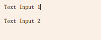
1
2
3
4
5
6
7
8
9
10
11
12
13
14
15
16
17
18
19
20
21
import QtQuick 2.5 Rectangle { width : 200 height : 80 color : "linen" TextInput { id: input1 x : 8 ; y : 8 width : 96 ; height : 20 focus : true text : "Text Input 1" } TextInput { id: input2 x : 8 ; y : 36 width : 96 ; height : 20 text : "Text Input 2" } }
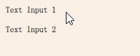
用户可以用鼠标单击TextInput元素以改变当前的输入焦点,如果需要通过键盘【Tab】手动切换焦点,则可以使用KeyNavigation附加属性,该属性支持将一个元素id作为预设的焦点切换目标。
1
2
3
4
5
6
7
8
9
10
11
12
13
14
15
16
17
18
19
20
21
22
23
24
import QtQuick 2.5 Rectangle { width : 200 height : 80 color : "linen" TextInput { id: input1 x : 8 ; y : 8 width : 96 ; height : 20 focus : true text : "Text Input 1" KeyNavigation.tab : input2 } TextInput { id: input2 x : 8 ; y : 36 width : 96 ; height : 20 text : "Text Input 2" KeyNavigation.tab : input1 } }
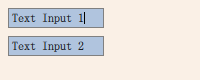
TextInput元素除了闪烁的光标和输入的文本之外,没有其它的可视化表现。为了让用户能够清晰的识别输入元素,这里可以绘制一个矩形装饰,然后以组件TLineEditV1.qml的形式进行导出。
1
2
3
4
5
6
7
8
9
10
11
12
13
14
15
16
17
import QtQuick 2.5 Rectangle { width : 96 ; height : input.height + 14 color : "lightsteelblue" border.color : "gray" property alias text : input.text property alias input : input TextInput { id: input anchors.fill : parent anchors.margins : 4 focus : true } }
采用property alias input: input可以完全的导出TextInput元素。其中,第
1 个input是属性名,第 2
个input则是TextInput元素的id。接下来,就采用新的TLineEditV1.qml组件重写上面的【Tab】按键导航示例:
1
2
3
4
5
6
7
8
9
10
11
12
13
14
15
16
17
18
19
20
21
22
import QtQuick 2.5 Rectangle { width : 200 height : 80 color : "linen" TLineEditV1 { id: input1 x : 8 ; y : 8 focus : true text : "Text Input 1" KeyNavigation.tab : input2 } TLineEditV1 { id: input2 x : 8 ; y : 36 text : "Text Input 2" KeyNavigation.tab : input1 onFocusChanged : print('focus' ) } }
上面的示例虽然能够展现矩形装饰效果,却无法有效的使用【Tab】切换输入焦点,因此在这里并不能仅仅只采用focus: true属性。造成这个问题的原因,是由于当需要将焦点切换至input2元素时,TlineEditV1组件的顶层项目接收了焦点,但是并没有将焦点事件转发至TextInput元素。为此,QML
提供了FocusScope元素防止这种情况的发生。
FocusScope 元素
FocusScope元素用于声明焦点的作用域,如果其接收到输入焦点,则带有focus: true的最后一个子元素将会接收该焦点事件。接下来,将焦点作用域作为根元素,创建改进版的TLineEditV2.qml组件。
1
2
3
4
5
6
7
8
9
10
11
12
13
14
15
16
17
18
19
20
21
22
import QtQuick 2.5 FocusScope { width : 96 ; height : input.height + 8 ; Rectangle { anchors.fill : parent color : "lightsteelblue" border.color : "gray" } property alias text : input.text property alias input : input TextInput { id: input anchors.fill : parent anchors.margins : 4 focus : true } }
现在示例代码看起来是下面的样子,按下【Tab】就能成功的切换了 2
个组件之间的焦点,并将焦点对准组件内的TextInput子元素。
1
2
3
4
5
6
7
8
9
10
11
12
13
14
15
16
17
18
19
20
21
import QtQuick 2.5 Rectangle { width : 200 height : 80 color : "linen" TLineEditV2 { id: input1 x : 8 ; y : 8 focus : true text : "Text Input 1" KeyNavigation.tab : input2 } TLineEditV2 { id: input2 x : 8 ; y : 36 text : "Text Input 2" KeyNavigation.tab : input1 } }
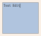
TextEdit 元素
TextEdit元素的功能与TextInput类似,不过它可以支持多行文本编辑,而且它没有文本约束属性,需要依赖于查询文本的绘制大小(paintedHeight和paintedWidth)。下面的例子当中,我们创建了一个包含有背景装饰的自定义组件TTextEdit.qml,并且采用了FocusScope元素完成焦点转发。
1
2
3
4
5
6
7
8
9
10
11
12
13
14
15
16
17
18
19
20
21
22
import QtQuick 2.5 FocusScope { width : 96 ; height : 96 ; Rectangle { anchors.fill : parent color : "lightsteelblue" border.color : "gray" } property alias text : input.text property alias input : input TextEdit { id: input anchors.fill : parent anchors.margins : 4 focus : true } }
1
2
3
4
5
6
7
8
9
10
11
12
13
14
15
import QtQuick 2.5 Rectangle { width : 136 height : 120 color : "linen" TTextEdit { id: input x : 8 ; y : 8 width : 120 ; height : 104 ; focus : true text : "Text Edit" } }
Keys 属性
附加属性Keys用于执行一些按键事件代码,例如:实现一个正方形的移动(上下左右按键)与缩放(加减按键)。
1
2
3
4
5
6
7
8
9
10
11
12
13
14
15
16
17
18
19
20
21
22
23
24
25
26
import QtQuick 2.5 DarkSquare { width : 400 ; height : 200 GreenSquare { id: square x : 8 ; y : 8 } focus : true Keys.onLeftPressed : square.x -= 8 Keys.onRightPressed : square.x += 8 Keys.onUpPressed : square.y -= 8 Keys.onDownPressed : square.y += 8 Keys.onPressed : { switch (event.key) { case Qt.Key_Plus : square.scale += 0.2 break ; case Qt.Key_Minus : square.scale -= 0.2 break ; } } }
QML 性能
QML 和 Javascript
都属于解释型语言 ,这意味着它们在执行之前不需要进行编译,而是在执行引擎中运行。由于解释引擎性能开销较为昂贵,所以
Qt Quick
采用了即时(JIT)编译来提高性能(.qmlc和.jsc文件),同时还会缓存中间输出,避免重新编译。这些操作都是无缝进行的,唯一的痕迹是可以在.qml源文件旁边找到后缀名为.qmlc和.jsc的文件。
如果希望避免初始解析时导致的性能损失,还可以提前对 QML 与 Javascript
进行预编译处理,详细的操作可以参考 Qt 官方文档中的《Compiling
QML Ahead of Time》 。
QML/JavaScript
JavaScript 是 web
浏览器端开发的通用语言,同时也作为命令式语言加入到声明式的 QML 当中。QML
作为声明式语言用于展示用户界面,而 JavaScript
则用于对界面的操作进行表达。Qt 社区推荐将应用程序的 JavaScript
部分限制到最少,仅仅在 QML/JS 当中执行 UI 逻辑,而在 Qt C++
当中执行真正的业务逻辑。下面代码是一个在 QML 当中使用 JavaScript
的简短例子:
1
2
3
4
5
6
7
8
9
10
11
12
13
14
15
16
Button { width : 200 height : 300 property bool checked : false text : "Click to toggle" function doToggle ( checked = !checked } onTriggered : { doToggle(); console .log('checked: ' + checked) } }
JavaScript 可以作为独立的函数、模块出现在 QML
许多位置,甚至可以出现在每一个属性绑定的右侧:
1
2
3
4
5
6
7
8
9
10
11
12
13
14
15
16
import "util.js" as Util Button { width : 200 height : width*2 function log (msg ) console .log("Button> " + msg); } onTriggered : { log(); Qt.quit(); } }
HTML/JavaScript 与 QML/JavaScript
的不同之处在于:
HTML/JavaScript
拥有一个名为window的全局对象,可以用于与浏览器交互窗口(标题、URL
位置、DOM
树)进行交互。此外,浏览器还支持通过id或者class操作
DOM
节点,以及延时执行函数setTimeout()、周期重复函数setInterval()。除了这些由浏览器原生提供的
API 之外,其环境都类似于 QML/JavaScript。
HTML 当中,只能在初始页面或者事件处理程序当中执行
JavaScript,默认情况下,不能直接在 HTML/JavaScript 的属性上直接绑定
JavaScript,而 QML/JavaScript
里则可以方便的做到这一点。换而言之,QML/JavaScript 当中,JavaScript
更像是一等公民,更加深入的集成到 QML
渲染树里,从而使得语法更加可读。
语言
从表面上看,JavaScript 是一种较为常见的语言,语法上与其它类 C++
编程语言并无太大区别:
1
2
3
4
5
6
7
8
9
10
11
12
function countDown1 ( for (var i=0 ; i<10 ; i++) { console .log('index: ' + i) } } function countDown2 ( var i=10 ; while ( i>0 ) { i--; } }
但是值得注意的是,JavaScript
的函数作用域 并不完全类似于 C++
的块作用域 :
QML/JavaScript 当中if...else, break,
continue语句依然可以如同预期的那样进行工作,但是switch判断可以比较其它的数据类型,而并不像
C++ 当中那样仅仅判断整型。
1
2
3
4
5
6
7
8
9
10
function getAge (name ) switch (name) { case "father" : return 58 ; case "mother" : return 56 ; } return unknown; }
JavaScript
当中会把0、""、undefined、null作为false来处理,如果需要同时测试值 与数据类型 是否都相同,就必须使用===操作符。因为
JavaScript
相等运算符==仅仅只判断值是否相同,这是它与 C++
语言的另一个重要区别。而与 C++ 语言的另一个重要不同点在于:JavaScript
对于数组拥有自己的处理方式。
1
2
3
4
5
6
7
8
9
10
11
12
function doIt ( var a = [] a.push(10 ) a.push("Monkey" ) console .log(a.length) a[0 ] a[1 ] a[2 ] a[99 ] = "String" console .log(a.length) a[98 ] }
JavaScript
并不是一种纯粹的面向对象语言,而是一种基于原型prototype的语言,即对象的创建是基于原型的,每个对象都会拥有自己的prototype。如果需要测试一些
JavaScript 代码片段,那么可以使用浏览器控制台或者是编写一段 QML
代码:
1
2
3
4
5
6
7
8
9
10
11
import QtQuick 2.5 Item { function runJS ( console .log("Your JS code goes here" ); } Component.onCompleted : { runJS(); } }
对象
下面是 JavaScript 当中一部分需要被频繁使用到的对象与方法:
Math.floor(v)、Math.ceil(v)、Math.round(v):浮点数转换为整数(最小、最大、四舍五入);Math.random():创建一个介于0与1之间随机数;Object.keys(o):返回对象的可枚举属性(包括QObject);JSON.parse(s)、JSON.stringify(o):JavaScript 对象、
JSON 字符串的转换;Number.toFixed(p):固定浮点数精度;Date:日期操作对象;
下面列举一些关于如何在 QML 当中使用 JavaScript
的例子,注意Component.onCompleted里的代码会在 QML
组件实例化之后自动被运行:
打印 QML 元素的所有属性
1
2
3
4
5
6
7
8
9
10
11
12
13
import QtQuick 2.5 Item { id: root Component.onCompleted : { var keys = Object .keys(root); for (var i=0 ; i<keys.length; i++) { var key = keys[i]; console .log(key + ' : ' + root[key]); } } }
将对象解析为 JSON 字符串
1
2
3
4
5
6
7
8
9
10
11
12
13
14
import QtQuick 2.5 Item { property var obj : { key : 'value' } Component.onCompleted : { var data = JSON .stringify(obj); console .log(data); var obj = JSON .parse(data); console .log(obj.key); } }
打印当前日期
1
2
3
4
5
6
7
8
9
10
11
12
13
14
15
import QtQuick 2.5 Item { Timer { id: timeUpdater interval : 100 running : true repeat : true onTriggered : { var d = new Date (); console .log(d.getSeconds()); } } }
通过名称调用函数
1
2
3
4
5
6
7
8
9
10
11
12
13
14
15
16
17
import QtQuick 2.5 Item { id: root function doIt ( console .log("Hello Qt5 !" ) } Component.onCompleted : { root["doIt" ](); var fn = root["doIt" ]; fn.call() } }
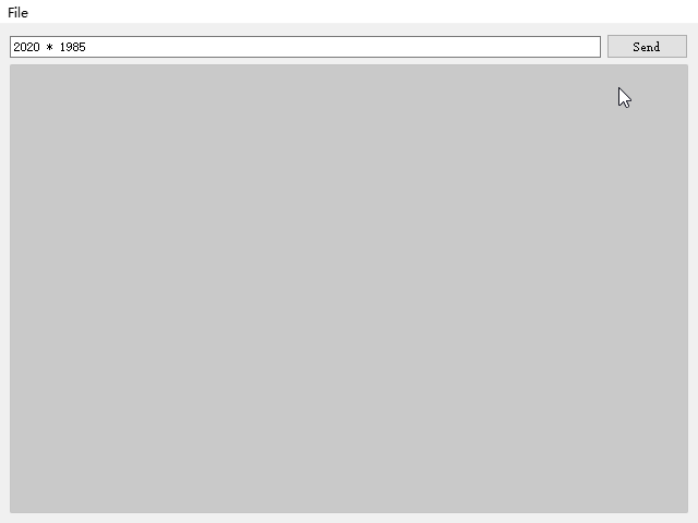
示例:JavaScript 控制台
本小节将会编写一个 JavaScript 控制台示例
JSConsole ,用户可以通过一个输入字段输入 JavaScript
表达式,然后输出结果列表。其中,输入功能采用了TextField元素和Button元素来完成,表达式的渲染结果则采用ListView元素进行显示,而ListModel作为数据模型,基于此编写如下的JSConsole.qml源文件:
1 2 3 4 5 6 7 8 9 10 11 12 13 14 15 16 17 18 19 20 21 22 23 24 25 26 27 28 29 30 31 32 33 34 35 36 37 38 39 40 41 42 43 44 45 46 47 48 49 50 51 52 53 54 55 56 57 58 59 60 61 62 63 64 65 66 67 68 69 70 71 72 73 74 75 76 77 78 79 80 81 82 83 84 85 86 87 88 89 90 91 92 93 94 95 96 import QtQuick 2.5 import QtQuick.Controls 1.5 import QtQuick.Layouts 1.2 import QtQuick.Window 2.2 import "jsconsole.js" as UtilApplicationWindow { id: root title : qsTr("JSConsole" ) width : 640 height : 480 menuBar : MenuBar { Menu { title : qsTr("File" ) MenuItem { text : qsTr("Exit" ) onTriggered : Qt.quit(); } } } ColumnLayout { anchors.fill : parent anchors.margins : 9 RowLayout { Layout.fillWidth : true TextField { id: input Layout.fillWidth : true focus : true onAccepted : { root.jsCall(input.text) } } Button { text : qsTr("Send" ) onClicked : { root.jsCall(input.text) } } } Item { Layout.fillWidth : true Layout.fillHeight : true Rectangle { anchors.fill : parent color : '#333' border.color : Qt.darker(color ) opacity : 0.2 radius : 2 } ScrollView { id: scrollView anchors.fill : parent anchors.margins : 9 ListView { id: resultView model : ListModel { id: outputModel } delegate : ColumnLayout { width : ListView.view.width Label { Layout.fillWidth : true color : 'green' text : "> " + model.expression } Label { Layout.fillWidth : true color : 'blue' text : "" + model.result } Rectangle { height : 1 Layout.fillWidth : true color : '#333' opacity : 0.2 } } } } } } function jsCall (exp ) var data = Util.call(exp); outputModel.insert(0 , data) } }
上面代码中的渲染函数jsCall()并不实现渲染本身的功能细节,而是将渲染逻辑抽象至一个
JavaScript
模块jsconsole.js,从而清晰的分离展示逻辑 与业务逻辑 。
1 2 3 4 5 6 7 8 9 10 11 12 13 14 15 16 17 18 19 20 21 22 23 .pragma library var scope = { } function call (msg ) { var exp = msg.toString (); console .log (exp) var data = { expression : msg } try { var fun = new Function ('return (' + exp + ');' ); data.result = JSON .stringify (fun.call (scope), null , 2 ) console .log ('scope: ' + JSON .stringify (scope, null , 2 ) + 'result: ' + result) } catch (e) { console .log (e.toString ()) data.error = e.toString (); } return data; }
上面的 JavaScript
函数call()调用之后将会返回一个包含有data、expression、result、error属性的对象。这样,就可以直接在列表模型当中使用这些对象(从delegate委托进行访问),例如通过model.expression可以获取到输入表达式。
Qt Quick Controls 2
Qt Quick Controls 2 是 Qt Quick
的一套精心设计的控件库,提供了一系列开箱即用的样式,默认为扁平化的Flat风格。此外,还可以选择基于微软《Universal
Design
Guidelines》的Universal style风格,基于谷歌《Material
Design
Guidelines》的Material style风格,以及面向桌面的Fusion style风格。通过QtQuick.Controls模块可以导入
Qt Quick Controls 2
控件库,该模块中包含了按钮、标签、复选框、滑块等控件。除此之外,下面的模块也较为常用:
模块
描述
QtQuick.Controls基本控件;
QtQuick.Templates提供非可视化的部分控件;
QtQuick.Dialogs提供用于显示消息、选择文件、选择颜色和字体的标准对话框,以及自定义对话框的基类;
QtQuick.Controls.Universal通用 Universal 样式主题支持;
QtQuick.Controls.Material通用 Material 样式主题支持;
Qt.labs.calendar支持日期选择以及其它日历相关的交互控件;
Qt.labs.platform提供操作系统平台原生对话框的支持,可以包含选择文件与颜色、系统托盘图标与标准路径;
注意
Qt.labs模块属于实验性质,因此后期的 Qt
版本可能会进行破坏性的更新。
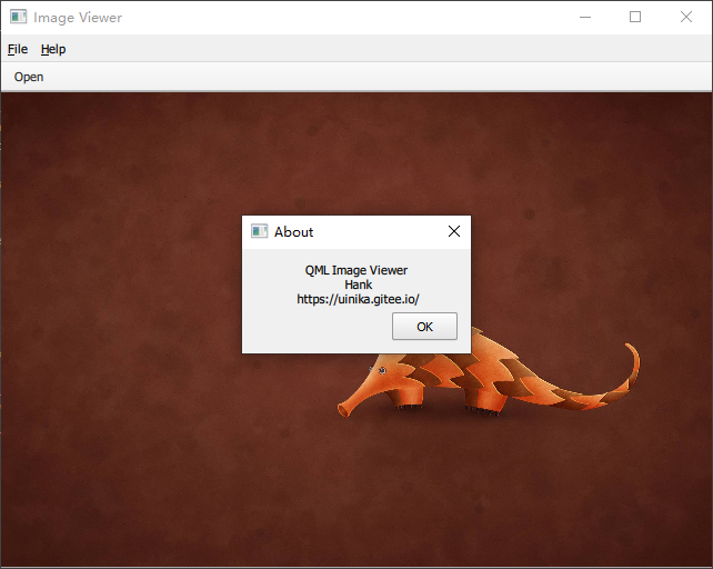
示例:图片查看器
本小节通过 Qt Quick Controls 2 创建一个具有桌面 Fusion
风格的图片查看器,后续小节会将其修改为移动端风格。
桌面端风格
桌面版基于经典的应用程序窗口,包含 1 个菜单栏、1 个工具栏、1
个文档区域。首先,在 Qt Creator
上建立一个Qt Quick Application Template工程,并向项目配置文件imageviewer.pro中添加如下配置内容:
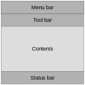
然后,将默认的Window元素替换为QtQuick.Controls里的ApplicationWindow元素。ApplicationWindow元素由菜单栏(Menu
bar )、工具栏(Tool bar )、状态栏(Status
bar )、内容区域(Contents )四个主要部分组成,其中前三者通常由MenuBar、ToolBar、TabBar元素的实例进行填充:
本图片查看器当中没有提供状态栏,下面的main.qml源代码设置了默认的窗口尺寸和标题,以及其它的界面元素:
1
2
3
4
5
6
7
8
9
10
11
12
13
14
15
16
17
18
19
20
21
22
23
24
25
26
27
28
29
30
31
32
33
34
35
36
37
38
39
40
41
42
43
44
45
46
47
48
49
50
51
52
53
54
55
56
57
58
59
60
61
62
63
64
65
66
67
68
69
70
71
72
73
74
75
76
77
import QtQuick 2.0 import QtQuick.Controls 2.4 import QtQuick.Dialogs 1.2 ApplicationWindow { visible : true width : 640 height : 480 title : qsTr("Image Viewer" ) menuBar : MenuBar { Menu { title : qsTr("&File" ) MenuItem { text : qsTr("&Open..." ) icon.name : "document-open" onTriggered : fileOpenDialog.open() } } Menu { title : qsTr("&Help" ) MenuItem { text : qsTr("&About..." ) onTriggered : aboutDialog.open() } } } header : ToolBar { Flow { anchors.fill : parent ToolButton { text : qsTr("Open" ) icon.name : "document-open" onClicked : fileOpenDialog.open() } } } background : Rectangle { color : "darkGray" } Image { id: image anchors.fill : parent fillMode : Image.PreserveAspectFit asynchronous : true } FileDialog { id: fileOpenDialog title : "Select an image file" folder : shortcuts.documents nameFilters : [ "Image files (*.png *.jpeg *.jpg)" , ] onAccepted : { image.source = fileOpenDialog.fileUrl } } Dialog { id: aboutDialog title : qsTr("About" ) Label { anchors.fill : parent text : qsTr("QML Image Viewer \n Hank \n https://uinika.gitee.io/" ) horizontalAlignment : Text.AlignHCenter } standardButtons : StandardButton.Ok } }
向main.cpp中添加QQuickStyle::setStyle("Fusion");以选择Fusion 风格:
1 2 3 4 5 6 7 8 9 10 11 12 13 14 15 16 #include <QGuiApplication> #include <QQmlApplicationEngine> #include <QQuickStyle> int main (int argc, char *argv[]) QGuiApplication::setAttribute (Qt::AA_EnableHighDpiScaling); QGuiApplication app (argc, argv) ; QQuickStyle::setStyle ("Fusion" ); QQmlApplicationEngine engine; engine.load (QUrl ("qrc:/main.qml" )); return app.exec (); }
移动端风格
移动设备上的 UI
界面与桌面应用程序相比,最大的不同之处在于屏幕尺寸较小所带来的操作局限性,因此本小节将不再使用传统的菜单栏与工具栏,而是采用了一个可伸缩的抽屉来供用户进行选择操作。
首先,将main.cpp当中定义的Fusion风格修改为Material风格:
1 QQuickStyle::setStyle ("Material" );
然后,着手将菜单栏替换为Drawer抽屉元素,从而实现更加适用于移动设备的
UI 效果:
1
2
3
4
5
6
7
8
9
10
11
12
13
14
15
16
17
18
19
20
21
22
23
24
25
26
27
28
29
30
31
32
33
34
35
36
37
38
39
40
41
42
43
44
45
46
47
48
49
50
51
52
53
54
55
56
57
58
59
60
61
62
63
64
65
66
67
68
69
70
71
72
73
74
75
76
77
78
79
80
81
82
83
84
85
86
87
88
89
90
91
92
93
94
95
96
97
98
99
100
101
102
import QtQuick 2.0 import QtQuick.Controls 2.4 import QtQuick.Dialogs 1.2 import QtQuick.Controls.Material 2.1 ApplicationWindow { id: window visible : true width : 360 height : 520 title : qsTr("Image Viewer" ) Drawer { id: drawer width : Math .min(window .width, window .height) / 3 * 2 height : window .height ListView { focus : true currentIndex : -1 anchors.fill : parent delegate : ItemDelegate { width : parent .width text : model.text highlighted : ListView.isCurrentItem onClicked : { drawer.close() model.triggered() } } model : ListModel { ListElement { text : qsTr("Open..." ) triggered : function ( } ListElement { text : qsTr("About..." ) triggered : function ( } } ScrollIndicator.vertical : ScrollIndicator { } } } header : ToolBar { Material.background : Material.Orange ToolButton { id: menuButton anchors.left : parent .left anchors.verticalCenter : parent .verticalCenter icon.source : "images/baseline-menu-24px.svg" onClicked : drawer.open() } Label { anchors.centerIn : parent text : "Image Viewer" font.pixelSize : 20 elide : Label.ElideRight } } background : Rectangle { color : "darkGray" } Image { id: image anchors.fill : parent fillMode : Image.PreserveAspectFit asynchronous : true } FileDialog { id: fileOpenDialog title : "Select an image file" folder : shortcuts.documents nameFilters : [ "Image files (*.png *.jpeg *.jpg)" , ] onAccepted : { image.source = fileOpenDialog.fileUrl } } Dialog { id: aboutDialog title : qsTr("About" ) Label { anchors.fill : parent text : qsTr("QML Image Viewer \n Hank \n https://uinika.gitee.io/" ) horizontalAlignment : Text.AlignHCenter } standardButtons : StandardButton.Ok } }
文件选择器
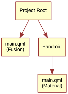
前面 2
个小节当中,分别为图片查看器开发了适用于桌面端以及移动端的版本。仔细观察会发现
2 个项目存在大量可以复用的代码,这里可以通过 QML 的文件选择器(File
Selectors)将这些代码抽象出来。Qt
的文件选择器可以基于当前激活的选择器,有选择性的替换掉某个源文件,QFileSelector类的文档android、ios、osx、linux、qnx等等;也可以基于
Linux
发行版的名称,例如:debian、ubuntu、fedora;或者基于语言环境,例如:en_US、sv_SE等等。
在图片查看器应用程序当中,我们将桌面版本设置为默认风格,如果android选择器被激活(将操作系统的环境变量QT_FILE_SELECTORS设置为android以模拟该行为)则自动切换至Material风格。因此,通过
Qt Creator
创建一个名为+选择器名称的目录,然后将与待替换文件同名的文件放入该目录里;当android选择器被激活的时候,就会执行该目录当中的文件,而非默认文件。
首先,将共享代码提取到ImageViewerWindow.qml文件,其中包括对话框、图像元素、背景设置。
1 2 3 4 5 6 7 8 9 10 11 12 13 14 15 16 17 18 19 20 21 22 23 24 25 26 27 28 29 30 31 32 33 34 35 36 37 38 39 40 41 42 43 44 45 import QtQuick 2.0 import QtQuick.Controls 2.4 import QtQuick.Dialogs 1.2 ApplicationWindow { function openFileDialog ( function openAboutDialog ( visible : true title : qsTr("Image Viewer" ) background : Rectangle { color : "darkGray" } Image { id: image anchors.fill : parent fillMode : Image.PreserveAspectFit asynchronous : true } FileDialog { id: fileOpenDialog title : "Select an image file" folder : shortcuts.documents nameFilters : [ "Image files (*.png *.jpeg *.jpg)" ] onAccepted : image.source = fileOpenDialog.fileUrl; } Dialog { id: aboutDialog title : qsTr("About" ) standardButtons : StandardButton.Ok Label { anchors.fill : parent text : qsTr("QML Image Viewer \n Hank \n https://uinika.gitee.io/" ) horizontalAlignment : Text.AlignHCenter } } }
接下来,创建一个新的main.qml源文件,将桌面版本的Fusion作为默认风格:
1 2 3 4 5 6 7 8 9 10 11 12 13 14 15 16 17 18 19 20 21 22 23 24 25 26 27 28 29 30 31 32 33 34 35 36 37 38 39 import QtQuick 2.0 import QtQuick.Controls 2.4 ImageViewerWindow { id: window width : 640 height : 480 menuBar : MenuBar { Menu { title : qsTr("&File" ) MenuItem { text : qsTr("&Open..." ) icon.name : "document-open" onTriggered : window .openFileDialog() } } Menu { title : qsTr("&Help" ) MenuItem { text : qsTr("&About..." ) onTriggered : window .openAboutDialog() } } } header : ToolBar { Flow { anchors.fill : parent ToolButton { text : qsTr("Open" ) icon.name : "document-open" onClicked : window .openFileDialog() } } } }
再接下来,还需要创建一个特定于android选择器并基于Material风格的main.qml,同时保留抽屉菜单以及工具栏;同样,唯一发生变化的地方在于对话框的打开方式。
1 2 3 4 5 6 7 8 9 10 11 12 13 14 15 16 17 18 19 20 21 22 23 24 25 26 27 28 29 30 31 32 33 34 35 36 37 38 39 40 41 42 43 44 45 46 47 48 49 50 51 52 53 54 55 56 57 58 59 60 61 62 import QtQuick 2.0 import QtQuick.Controls 2.4 import QtQuick.Controls.Material 2.1 ImageViewerWindow { id: window width : 360 height : 520 Drawer { id: drawer width : Math .min(window .width, window .height) / 3 * 2 height : window .height ListView { focus : true currentIndex : -1 anchors.fill : parent delegate : ItemDelegate { width : parent .width text : model.text highlighted : ListView.isCurrentItem onClicked : { drawer.close() model.triggered() } } model : ListModel { ListElement { text : qsTr("Open..." ) triggered : function (window .openFileDialog(); } } ListElement { text : qsTr("About..." ) triggered : function (window .openAboutDialog(); } } } ScrollIndicator.vertical : ScrollIndicator { } } } header : ToolBar { Material.background : Material.Orange ToolButton { id: menuButton anchors.left : parent .left anchors.verticalCenter : parent .verticalCenter icon.source : "images/baseline-menu-24px.svg" onClicked : drawer.open() } Label { id: titleLabel anchors.centerIn : parent text : "Image Viewer" font.pixelSize : 20 elide : Label.ElideRight } } }
这样,当前项目当中存在 2 个main.qml源文件,QML
执行引擎会自动创建文件选择器,默认情况下Fusion风格的main.qml被加载,如果android选择器被激活,则会改为装载Material风格的main.qml。
到目前为止,两种不同风格的界面被分别定义在两个main.cpp文件,接下来可以使用#ifdef表达式判断不同的平台并设置不同的风格。当然,也可以通过下面的配置文件手动进行Material和Fusion风格的选择。
1
2
[Controls] Style = Material
原生对话框
使用图像查看器时,会注意其使用了一个非标准的文件选择对话框,与应用程序并不适配。Qt.labs.platform模块可以用于解决这个问题,它可以将
QML 绑定至原生对话框、文件选择器、字体选择器、颜色选择器,甚至还提供 API
来创建系统托盘图标,以及系统全局菜单。这些功能依赖于QtWidgets模块,当缺少原生支持时,就会回退到基于QtWidgets的文件选择对话框。
1
2
3
4
5
6
7
8
9
10
11
12
13
14
15
16
17
18
19
20
21
22
23
24
25
26
27
28
29
30
31
32
33
34
35
36
37
38
39
40
41
42
43
44
45
46
47
48
49
50
51
52
53
54
55
56
57
58
59
60
61
62
63
64
65
66
67
68
69
70
71
72
73
import QtQuick 2.0 import QtQuick.Controls 2.4 import Qt.labs.platform 1.0 ApplicationWindow { visible : true width : 640 height : 480 title : qsTr("Image Viewer" ) menuBar : MenuBar { Menu { title : qsTr("&File" ) MenuItem { text : qsTr("&Open..." ) icon.name : "document-open" onTriggered : fileOpenDialog.open() } } Menu { title : qsTr("&Help" ) MenuItem { text : qsTr("&About..." ) onTriggered : aboutDialog.open() } } } header : ToolBar { Flow { anchors.fill : parent ToolButton { text : qsTr("Open" ) icon.name : "document-open" onClicked : fileOpenDialog.open() } } } background : Rectangle { color : "darkGray" } Image { id: image anchors.fill : parent fillMode : Image.PreserveAspectFit asynchronous : true } FileDialog { id: fileOpenDialog title : "Select an image file" folder : StandardPaths.writableLocation(StandardPaths.DocumentsLocation) nameFilters : [ "Image files (*.png *.jpeg *.jpg)" , ] onAccepted : { image.source = fileOpenDialog.file } } Dialog { id: aboutDialog title : qsTr("About" ) Label { anchors.fill : parent text : qsTr("QML Image Viewer \n Hank \n https://uinika.gitee.io/" ) horizontalAlignment : Text.AlignHCenter } standardButtons : StandardButton.Ok } }
除了修改main.qml文件之外,还需要在 Qt Creator
项目文件中包含QtWidgets模块。
1 QT += quick quickcontrols2 widgets
最后,更新main.cpp,将QGuiApplication类(包含图形化应用程序所需的最小环境)替换为QApplication类(扩展了QGuiApplication的特性,并且需要QtWidgets的支持)。
1 2 3 4 5 6 #include <QApplication> int main (int argc, char *argv[]) QApplication app (argc, argv) ; }
通过上述一系列的修改,图片查看器可以在大部分系统平台上使用原生对话框,可以支持
iOS、带有GTK+ 的 Linux、macOS、Windows,对于 Android
则将采用QtWidgets模块提供的默认 Qt 对话框。
常用屏幕模式
可以采用 Qt Quick Controls 2
实现一些常见的用户界面模式,本小节将会展示一些较为常用的模式。
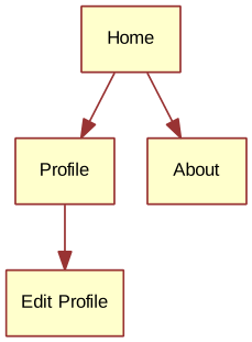
嵌套屏幕 Nested Screens
本小节将创建如下的嵌套页面树。
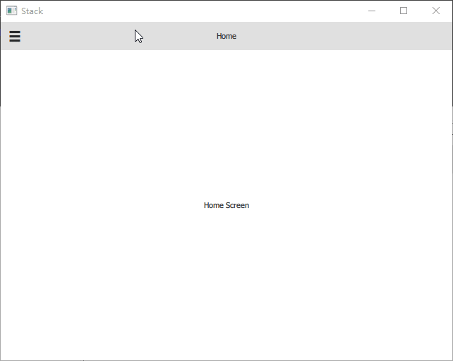
应用程序从main.qml界面开始启动,顶层元素ApplicationWindow当中包含有ToolBar、Drawer、StackView以及主页元素Home。
1 2 3 4 5 6 7 8 9 10 11 12 13 14 15 16 17 18 19 20 21 22 23 24 25 26 27 28 29 30 31 32 33 34 35 36 37 38 39 40 41 42 43 44 45 46 47 48 49 50 51 52 53 54 55 56 57 58 59 60 61 62 63 64 65 66 67 68 69 70 71 72 73 74 import QtQuick 2.9 import QtQuick.Controls 2.2 ApplicationWindow { id: window visible : true width : 640 height : 480 title : qsTr("Stack" ) header : ToolBar { contentHeight : toolButton.implicitHeight ToolButton { id: toolButton text : stackView.depth > 1 ? "\u25C0" : "\u2630" font.pixelSize : Qt.application.font.pixelSize * 1.6 onClicked : { if (stackView.depth > 1 ) { stackView.pop() } else { drawer.open() } } } Label { text : stackView.currentItem.title anchors.centerIn : parent } } Drawer { id: drawer width : window .width * 0.66 height : window .height Column { anchors.fill : parent ItemDelegate { text : qsTr("Profile" ) width : parent .width onClicked : { stackView.push("Profile.qml" ) drawer.close() } } ItemDelegate { text : qsTr("About" ) width : parent .width onClicked : { stackView.push(aboutPage) drawer.close() } } } } StackView { id: stackView anchors.fill : parent initialItem : Home {} } Component { id: aboutPage About {} } }
主页元素Home.qml是一个支持页眉和页脚的元素,下面代码仅仅将Label中的文本进行简单的居中,由于StackView的内容会自动填充 至堆栈视图,所以页面总是会拥有匹配的尺寸。
1 2 3 4 5 6 7 8 9 10 11 import QtQuick 2.9 import QtQuick.Controls 2.2 Page { title : qsTr("Home" ) Label { anchors.centerIn : parent text : qsTr("Home Screen" ) } }
下面分别是 About 和 Profile 页面的 QML 源文件:
1 2 3 4 5 6 7 8 9 10 11 import QtQuick 2.9 import QtQuick.Controls 2.2 Page { title : qsTr("About" ) Label { anchors.centerIn : parent text : qsTr("About" ) } }
1 2 3 4 5 6 7 8 9 10 11 12 13 14 15 16 17 18 19 20 21 22 import QtQuick 2.9 import QtQuick.Controls 2.2 Page { title : qsTr("Profile" ) Column { anchors.centerIn : parent spacing : 10 Label { anchors.horizontalCenter : parent .horizontalCenter text : qsTr("Profile" ) } Button { anchors.horizontalCenter : parent .horizontalCenter text : qsTr("Edit" ); onClicked : stackView.push("EditProfile.qml" ) } } }
如果还希望由Profile界面进入到EditProfile界面,则需要通过Profile.qml的Button元素来实现。
1 2 3 4 5 6 7 8 9 10 11 import QtQuick 2.9 import QtQuick.Controls 2.2 Page { title : qsTr("Edit Profile" ) Label { anchors.centerIn : parent text : qsTr("Editing the profile" ) } }
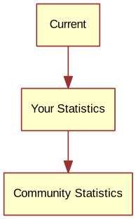
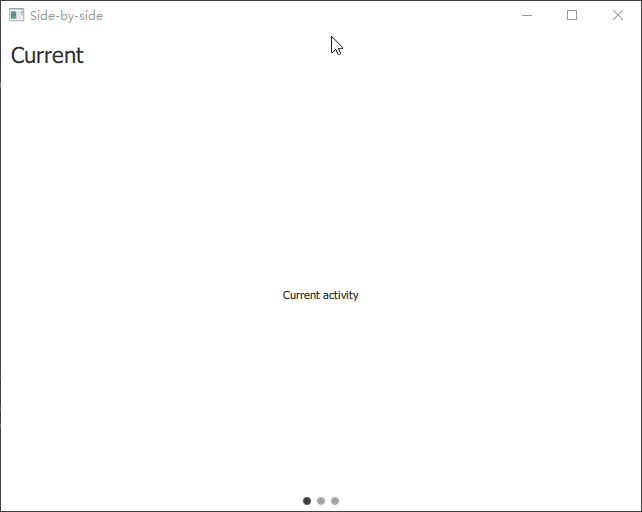
并列屏幕 Side by Side
Screens
本小节创建的图形界面由 3
个可以自由切换的页面组成,页面的具体结构如下所示:
并列屏幕的主要部分由一个支持并排屏幕交互的SwipeView元素管理,底部的
3
个点则是由PageIndicator元素实现的分页指示符,用于显示当前处于活动状态的页面。
1 2 3 4 5 6 7 8 9 10 11 12 13 14 15 16 17 18 19 20 21 22 23 24 25 26 27 28 import QtQuick 2.9 import QtQuick.Controls 2.2 ApplicationWindow { visible : true width : 640 height : 480 title : qsTr("Side-by-side" ) SwipeView { id: swipeView anchors.fill : parent Current {} UserStats {} TotalStats {} } PageIndicator { anchors.bottom : parent .bottom anchors.horizontalCenter : parent .horizontalCenter currentIndex : swipeView.currentIndex count : swipeView.count } }
Current.qml和UserStats.qml页面主要由Page元素内嵌的header和Label组成:
1 2 3 4 5 6 7 8 9 10 11 12 13 14 15 import QtQuick 2.9 import QtQuick.Controls 2.2 Page { header : Label { text : qsTr("Current" ) font.pixelSize : Qt.application.font.pixelSize * 2 padding : 10 } Label { text : qsTr("Current activity" ) anchors.centerIn : parent } }
1 2 3 4 5 6 7 8 9 10 11 12 13 14 15 import QtQuick 2.9 import QtQuick.Controls 2.2 Page { header : Label { text : qsTr("Your Stats" ) font.pixelSize : Qt.application.font.pixelSize * 2 padding : 10 } Label { text : qsTr("User statistics" ) anchors.centerIn : parent } }
TotalStats.qml除了包含header属性以外,还包括一个用作返回按钮的Button元素:
1 2 3 4 5 6 7 8 9 10 11 12 13 14 15 16 17 18 19 20 21 22 23 24 25 26 import QtQuick 2.9 import QtQuick.Controls 2.2 Page { header : Label { text : qsTr("Community Stats" ) font.pixelSize : Qt.application.font.pixelSize * 2 padding : 10 } Column { anchors.centerIn : parent spacing : 10 Label { anchors.horizontalCenter : parent .horizontalCenter text : qsTr("Community statistics" ) } Button { anchors.horizontalCenter : parent .horizontalCenter text : qsTr("Back" ) onClicked : swipeView.setCurrentIndex(0 ); } } }
注意 :以编程方式在SwipeView上进行导航时,不能直接赋值设置currentIndex,这样做会破坏其对应的
QML
绑定;正确的方式应该是采用setCurrentIndex()、incrementCurrentIndex()、decrementCurrentIndex()方法。
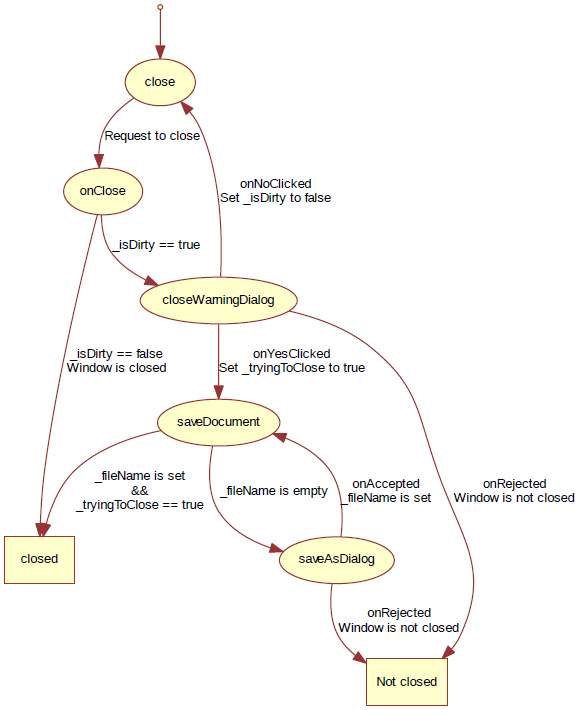
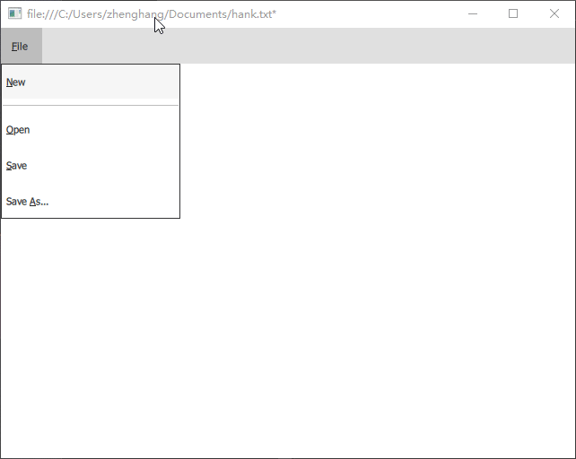
文档窗口 Document Windows
本小节展示如何实现一个面向桌面,并以文档为中心的图形界面。每个文档都拥有一个窗口,打开新文档时则会打开一个新窗口。
代码从一个带有文件菜单的ApplicationWindow应用程序窗口元素开始,并且包含新建、打开、保存、另存为操作,我们将这些功能放置在DocumentWindow.qml文件当中。
1 2 3 4 5 6 7 8 9 10 11 12 13 14 15 16 17 18 19 20 21 22 23 24 25 26 27 28 29 30 31 32 33 34 35 36 37 38 39 40 41 42 43 44 45 46 47 48 49 50 51 52 53 54 55 56 57 58 59 60 61 62 63 64 65 66 67 68 69 70 71 72 73 74 75 76 77 78 79 80 81 82 83 84 85 86 87 88 89 90 91 92 93 94 95 96 97 98 99 100 101 102 103 104 105 106 107 108 109 110 111 112 113 114 115 116 117 118 119 120 121 122 123 124 125 126 127 128 129 130 131 132 133 134 135 import QtQuick 2.0 import QtQuick.Controls 2.4 import Qt.labs.platform 1.0 as NativeDialogs ApplicationWindow { id: root title : (_fileName.length===0 ?qsTr("Document" ):_fileName) + (_isDirty?"*" :"" ) width : 640 height : 480 property bool _isDirty : true property string _fileName property bool _tryingToClose : false menuBar : MenuBar { Menu { title : qsTr("&File" ) MenuItem { text : qsTr("&New" ) icon.name : "document-new" onTriggered : root.newDocument() } MenuSeparator {} MenuItem { text : qsTr("&Open" ) icon.name : "document-open" onTriggered : openDocument() } MenuItem { text : qsTr("&Save" ) icon.name : "document-save" onTriggered : saveDocument() } MenuItem { text : qsTr("Save &As..." ) icon.name : "document-save-as" onTriggered : saveAsDocument() } } } function _createNewDocument ( var component = Qt.createComponent("DocumentWindow.qml" ); var window = component.createObject(); return window ; } function newDocument ( var window = _createNewDocument(); window .show(); } function openDocument (fileName ) openDialog.open(); } function saveAsDocument ( saveAsDialog.open(); } function saveDocument ( if (_fileName.length === 0 ) { root.saveAsDocument(); } else { console .log("Saving document" ) root._isDirty = false ; if (root._tryingToClose) root.close(); } } NativeDialogs.FileDialog { id: openDialog title : "Open" folder : NativeDialogs.StandardPaths.writableLocation(NativeDialogs.StandardPaths.DocumentsLocation) onAccepted : { var window = root._createNewDocument(); window ._fileName = openDialog.file; window .show(); } } NativeDialogs.FileDialog { id: saveAsDialog title : "Save As" folder : NativeDialogs.StandardPaths.writableLocation(NativeDialogs.StandardPaths.DocumentsLocation) onAccepted : { root._fileName = saveAsDialog.file saveDocument(); } onRejected : { root._tryingToClose = false ; } } onClosing : { if (root._isDirty) { closeWarningDialog.open(); close.accepted = false ; } } NativeDialogs.MessageDialog { id: closeWarningDialog title : "Closing document" text : "You have unsaved changed. Do you want to save your changes?" buttons : NativeDialogs.MessageDialog.Yes | NativeDialogs.MessageDialog.No | NativeDialogs.MessageDialog.Cancel onYesClicked : { root._tryingToClose = true ; root.saveDocument(); } onNoClicked : { root._isDirty = false ; root.close() } onRejected : { } } }
从main.qml创建 1
个DocumentWindow实例,并将其作为应用程序的入口点。
1 2 3 4 5 6 import QtQuick 2.0 DocumentWindow { visible : true }
注意 :与 C++/QtWidgets 相比,QML
的对话框是非阻塞式的,这意味着不能在switch语句里等待对话框的结果。相反,需要缓存状态并在相应的onYesClicked、onNoClicked、onAccepted、onRejected事件当中进一步处理。


